Are you seeking innovative solutions to elevate your vocational education programs? Do you find traditional methods struggle to keep pace with the demands of a ...
 Kyla Ball
7 min read
Kyla Ball
7 min read
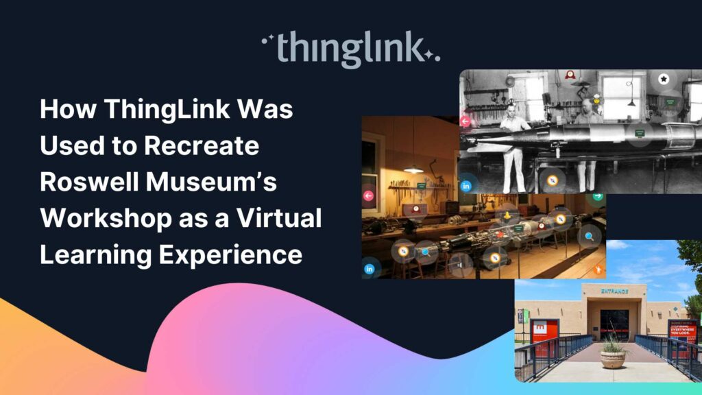
Background: A Museum Lost to Flooding When catastrophic flooding occurred at the Roswell Museum in New Mexico in October 2024, the loss went far beyond physical...
Kyla Ball
6 min read
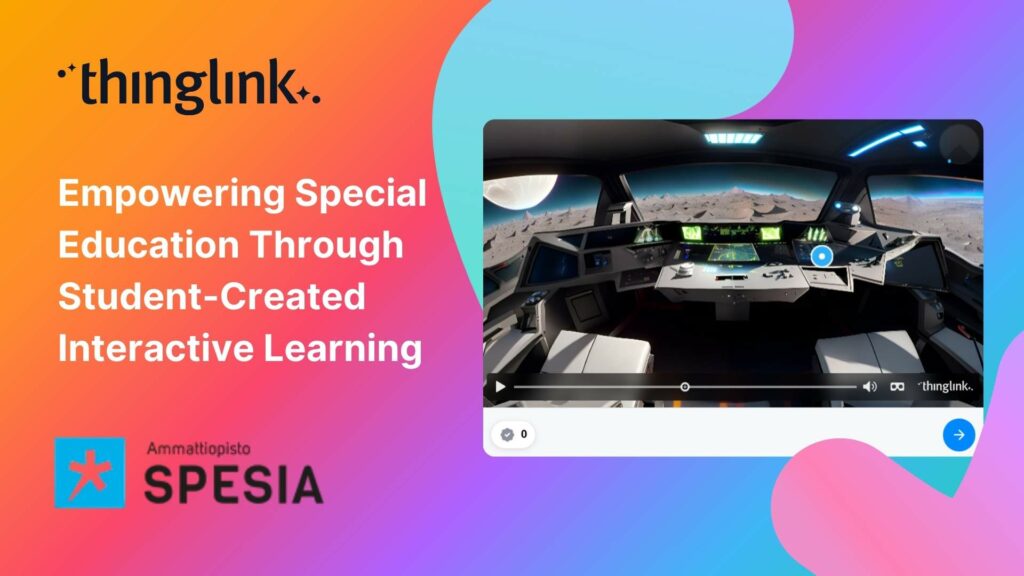
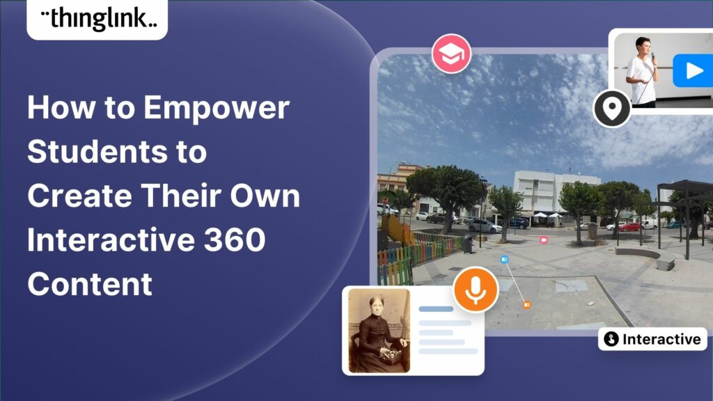
For students at Spesia vocational and special education college, ThingLink isn’t just a learning platform, but a tool for designing and building their own interactive...
Kyla Ball
5 min read
Background Tankespirerne (translated as “Thought Sprouts”) is a Danish educational consultancy led by Martin Kongshave, elementary school teacher and practitioner...
Kyla Ball
5 min read
Instructure is the global EdTech organization used by over 19 million unique users annually. It’s probably best-known as the home of Canvas, their flagship product...
Kyla Ball
5 min read
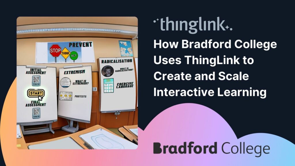
With more than 7,000 learners but only two dedicated digital learning designers, Bradford College faces a challenge familiar to many Further Education institutions:...
Kyla Ball
4 min read
Transforming Education with Gamified Learning Experiences Education stands on the edge of a significant transformation, driven by innovative technologies that redefine...
Kyla Ball
5 min read
This teacher training resource for students on the PGCE course (Post Graduate Certificate in Education) demonstrates how ThingLink can be used to create interactive...
Kyla Ball
4 min read
For many higher and further education institutions, the integration of new technologies like AV equipment often presents a double-edged sword. While advancements...
Kyla Ball
6 min read
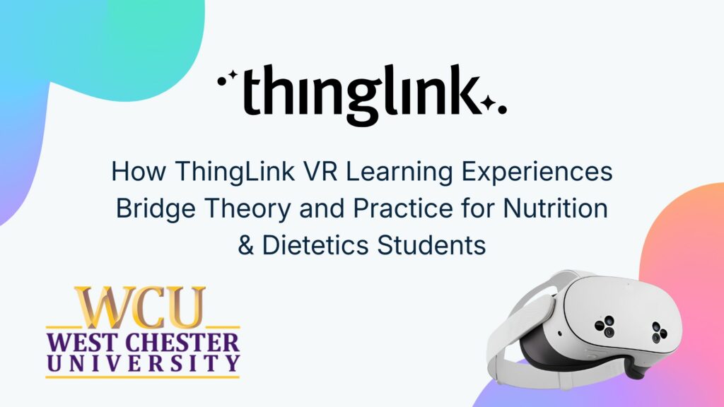
Nutrition and dietetics higher education programs face a critical challenge common across healthcare studies: effectively connecting theoretical knowledge with ...
Kyla Ball
9 min read
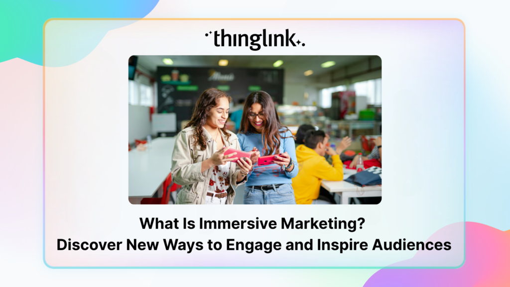
How can marketers truly attract and engage consumers in the saturated world of digital marketing? Attention is hard to earn and easy to lose. Audiences want something...
Some further education courses can move online easily, but how do you engage your online students in hands-on subjects involving machinery, materials and complex...
Kyla Ball
5 min read
ThingLink has recently made available an inspiring set of three conservation-based 360° videos, designed for learners, educators, and anyone curious about how ...
Kyla Ball
4 min read
From transmission network operators in Finland to a renewables training academy in Scotland, manufacturers in the U.S., and global industrial leaders, ThingLink...
Kyla Ball
6 min read
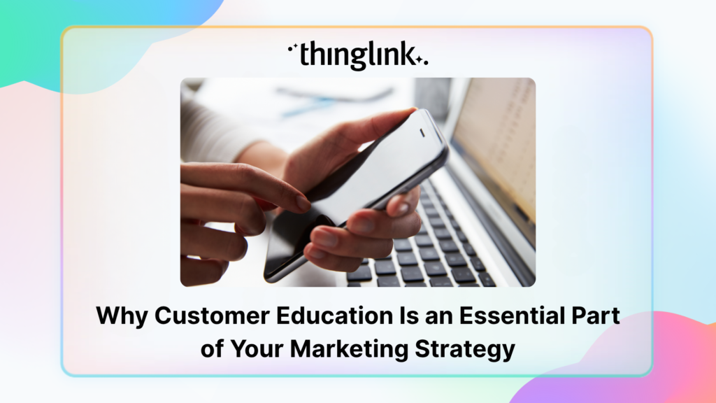
Customer education is core to marketing, not a separate tactic. It can be as simple as helping customers learn that your brand or product exists, or as deep as ...
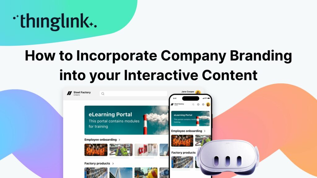
When creating any visual content for your business, it’s vital that your brand is reflected properly throughout the work. That goes for any content you create...
Are marketers a type of educator? As the Marketing Manager here at ThingLink, I’ve been pondering this question after I recently told one of my colleagues, “I...
At Hackbridge Primary, the introduction of ThingLink has transformed teaching and learning in a range of ways. In just a year, staff have seen shifts in how pupils...
Kyla Ball
5 min read
Flexible monthly subscriptions now make it easier for cultural institutions to bring collections and exhibitions to life with interactive tours and spatial storytelling....
Kyla Ball
2 min read
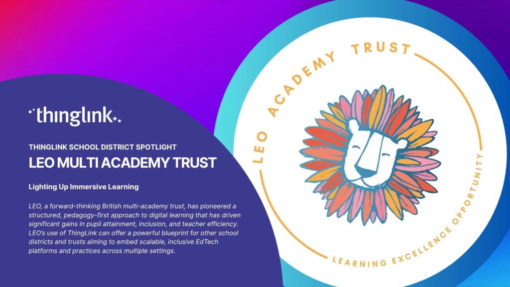
LEO, a forward-thinking British multi-academy trust, has pioneered a structured, pedagogy-first approach to digital learning that has driven significant gains in...
 Louise Jones
10 min read
Louise Jones
10 min read
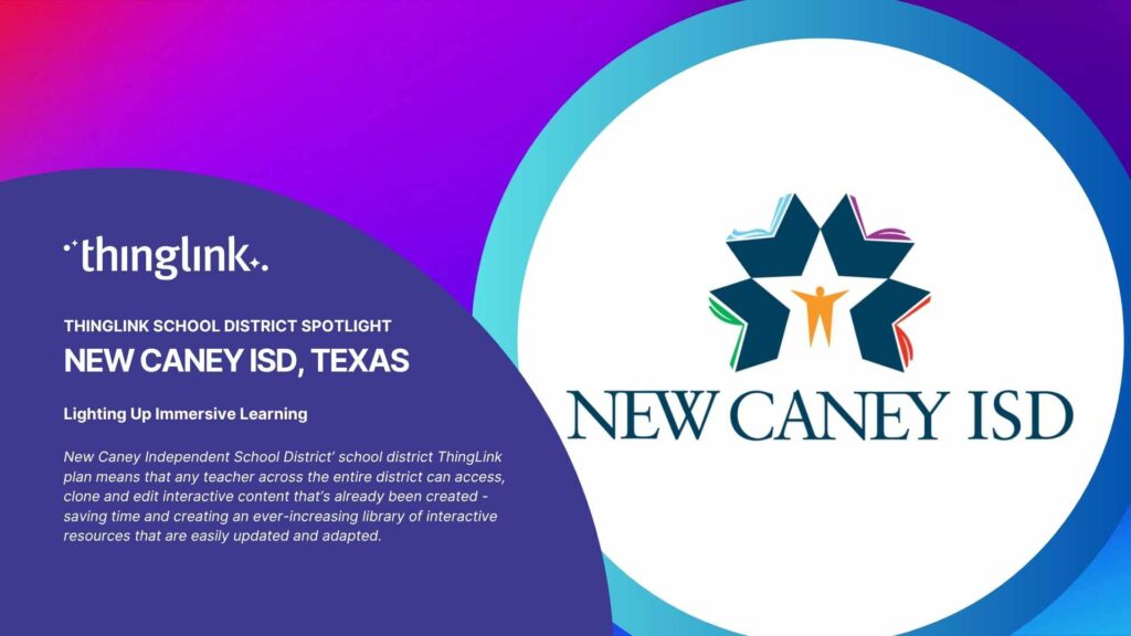
New Caney Independent School District (ISD) added ThingLink to their roster of online learning resources in 2020 and it soon became a valuable tool with many applications....
When their usual arts venue became unavailable for Nottingham College’s end-of-year show, the organizers found the ideal way to recreate and share the works...
Kyla Ball
4 min read
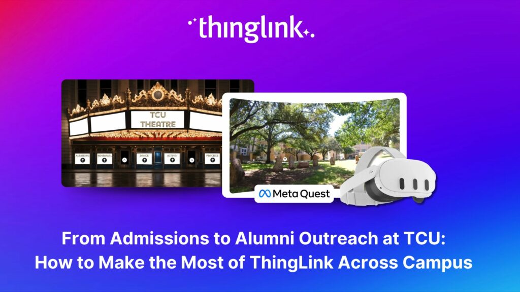
Background Texas Christian University (TCU) is a private university of around 9000 undergrads, situated in the city of Fort Worth within the Dallas Fort Worth metroplex....
Kyla Ball
7 min read
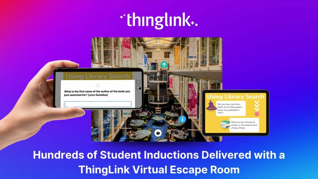
Louise Conway, Information Manager at the University of Hertfordshire (UK) has created an ingenious, engaging virtual escape room to ensure that new students are...
Kyla Ball
7 min read
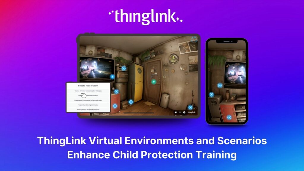
Background Zero Abuse Project (founded in 2018) is a non-profit organization based in the US. Their mission is “To protect children from abuse and sexual assault,...
Kyla Ball
8 min read
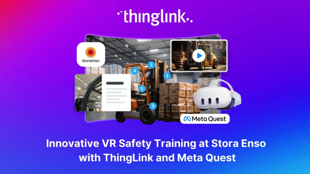
Updated 18.6.2025 Background Stora Enso is a company based in Finland and Sweden, and develops solutions based on wood and biomass for a diverse range of industries...
Kyla Ball
5 min read
Introduction With the development of new technologies, the boundaries between physical and digital learning spaces are being redefined. Yet, these environments ...
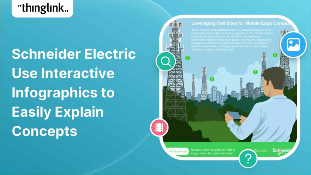
Infographics are the fastest and easiest way to present any complex information. In this blog we’ll show you how to create interactive infographic designs even...
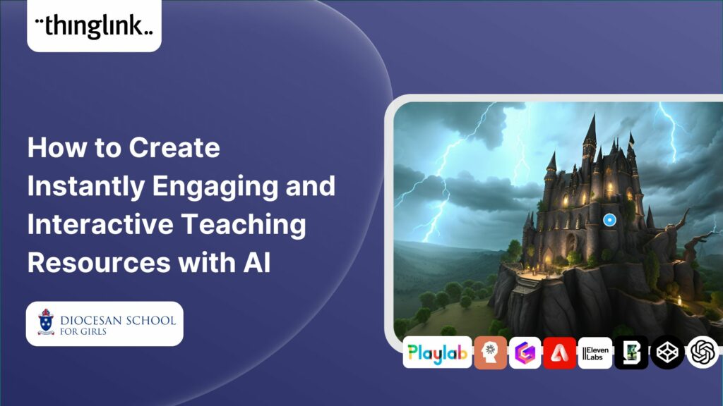
Rob McCrae is the AI Lead and ICT Director at Diocesan School for Girls in Auckland, New Zealand, an independent school of 1600 students aged 5-18. Earlier this...
Kyla Ball
5 min read
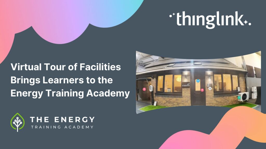
In this case study we explore how an innovative training provider is using ThingLink to help attract and develop the next generation of heating engineers ready ...
Kyla Ball
6 min read
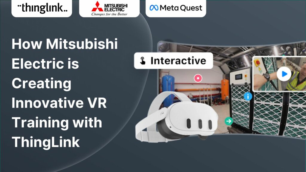
Mitsubishi Electric was founded over a century ago and now has offices around the world. The first Mitsubishi Electric UK (MEUK) office opened in 1969 and since...
Kyla Ball
7 min read
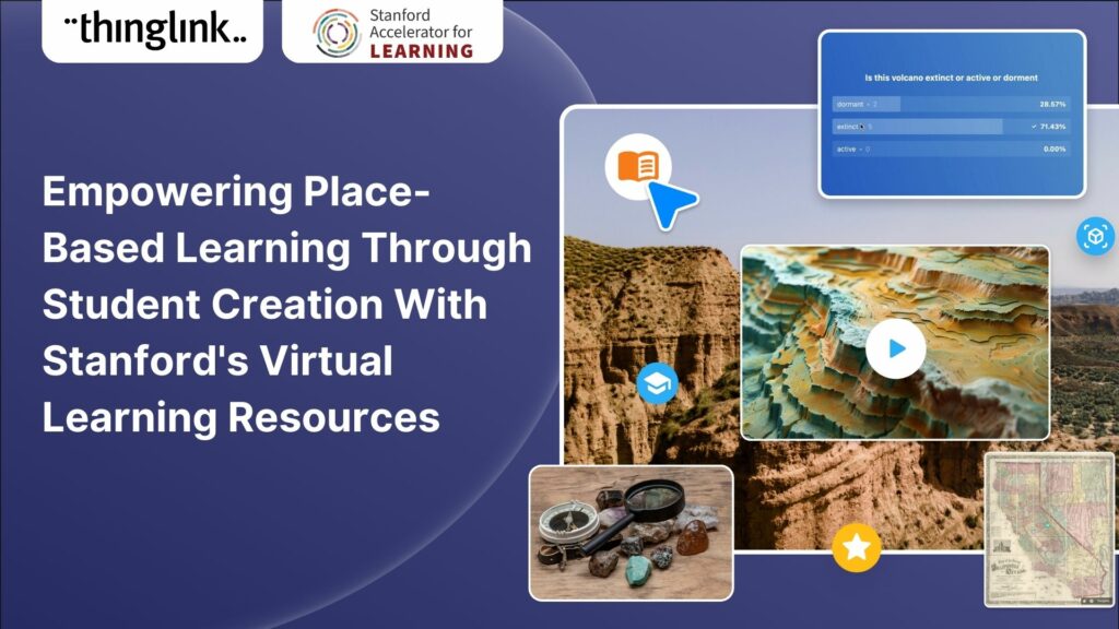
For educators looking to encourage student creation, Stanford University’s essential guide will show you how to use content from real-life Field Trips in ...
Kyla Ball
7 min read
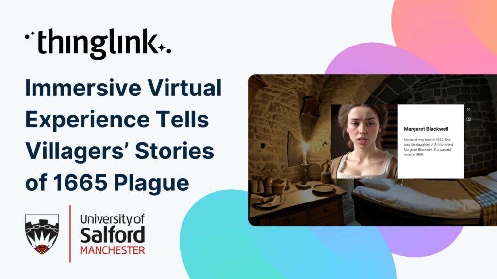
Immersive Virtual Experience Tells Villagers’ Stories of 1665 Plague A team at the University of Salford have created an immersive virtual experience of Eyam,...
Kyla Ball
3 min read
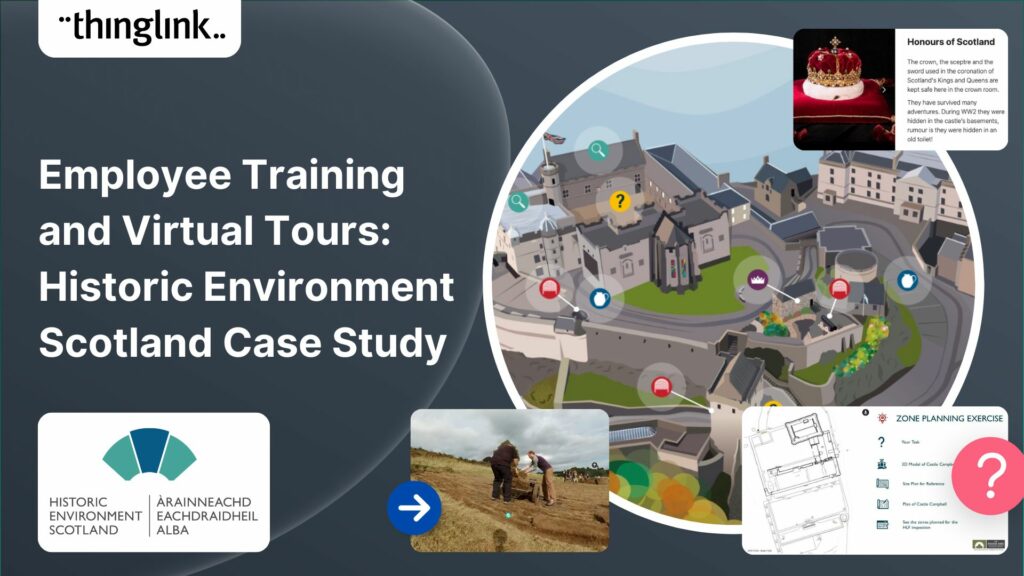
Caring for Scotland’s Heritage Historic Environment Scotland (HES) was formed in 2015 when Scottish Government agency Historic Scotland merged with the Royal ...
Kyla Ball
9 min read
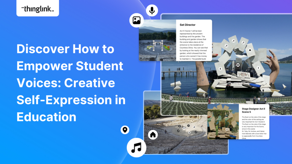
This case study features Rachel Silverman, a talented secondary English language arts teacher from Phormes Education in Germany. Rachel is a passionate advocate...
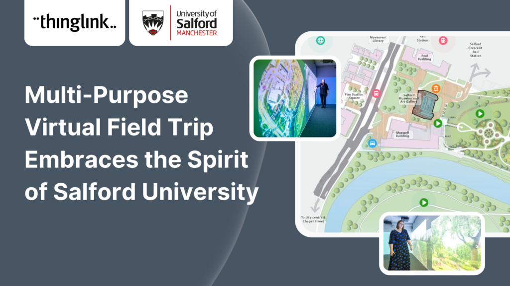
In this case study we look at an inspiring example of collaboration between a university and its local community. The university has created a multi-purpose interactive...
Kyla Ball
6 min read
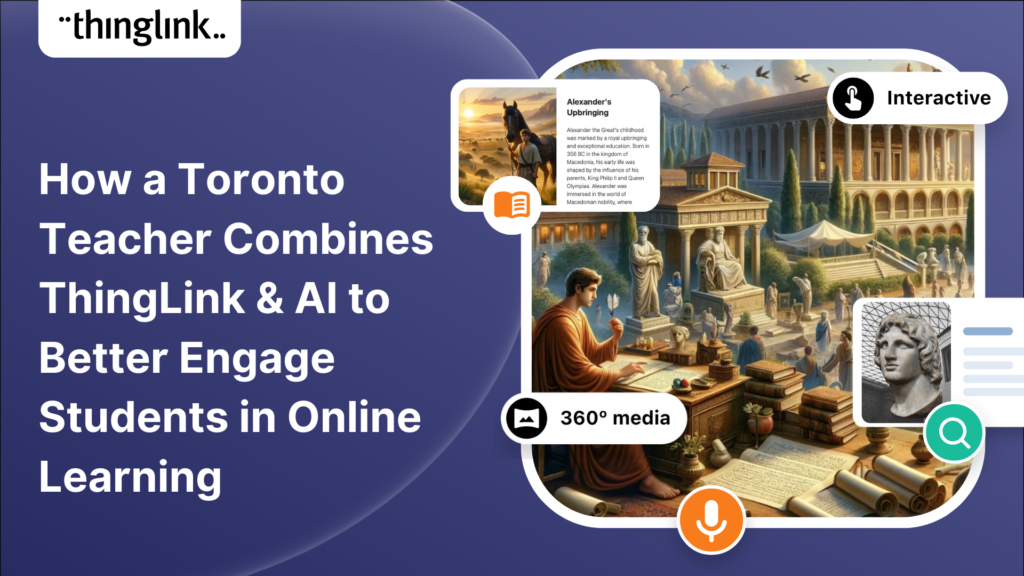
In this case study we are showcasing the inspiring work of Toronto teacher and ThingLink creator Joseph D’Aquila. Joseph’s creative use of AI tools and ThingLink...
Kyla Ball
4 min read
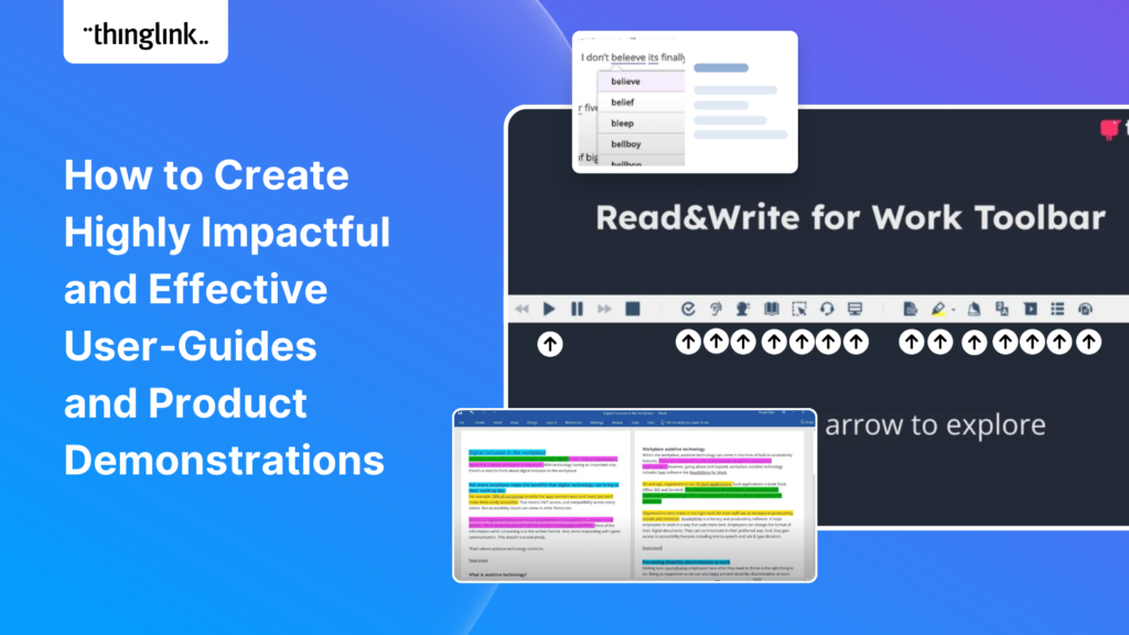
Optimize Your User Guides or Product Marketing Strategies with Interactive Product Demonstrations Using ThingLink Capturing your target audience’s attention...
Sabine Römer and Sarah Görlich are part of the e-learning department at the Ruhr University in Bochum, Germany. Together, they form a dynamic partnership that...
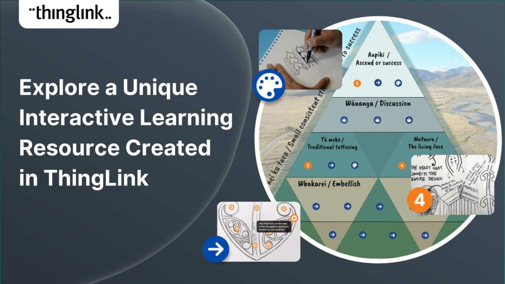
Katrina Lilly is a teacher at Te Aratai College in New Zealand, and recently finished a Masters in Contemporary Education at AcademyEx. As part of her masters she...
Kyla Ball
6 min read
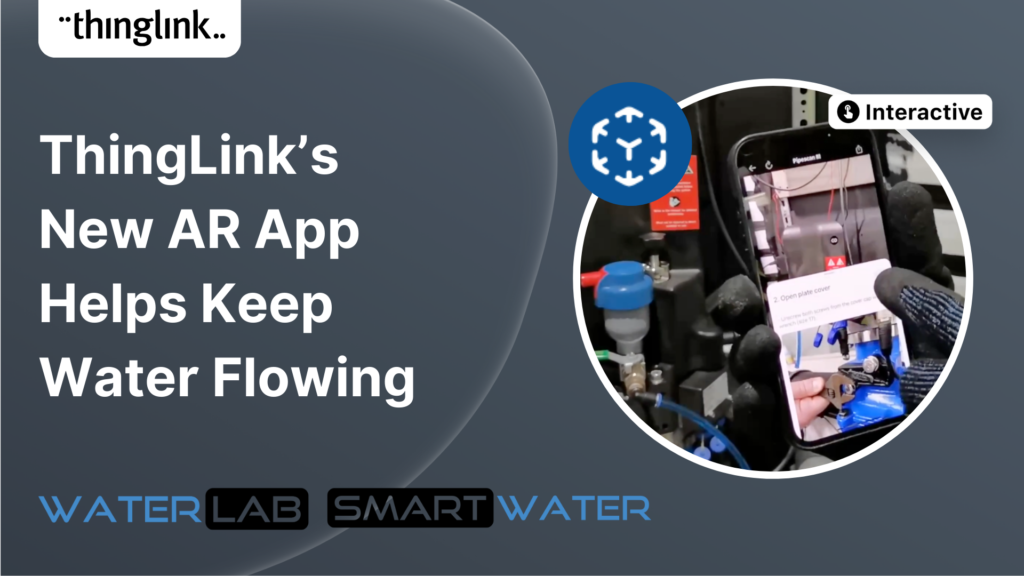
ThingLink’s AR Solution Helps Operators Troubleshoot Critical Water Network Issues Clean, safe water on demand is a fundamental expectation and mainstay...
Kyla Ball
7 min read
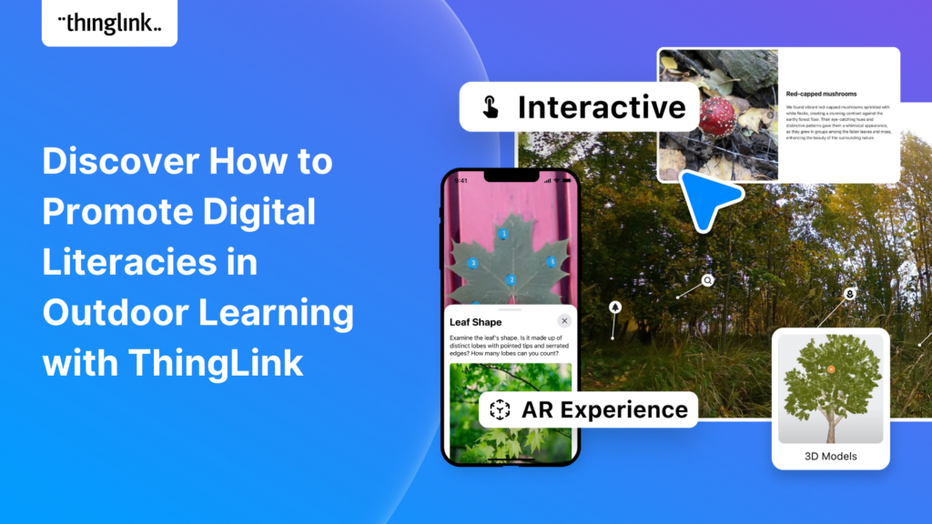
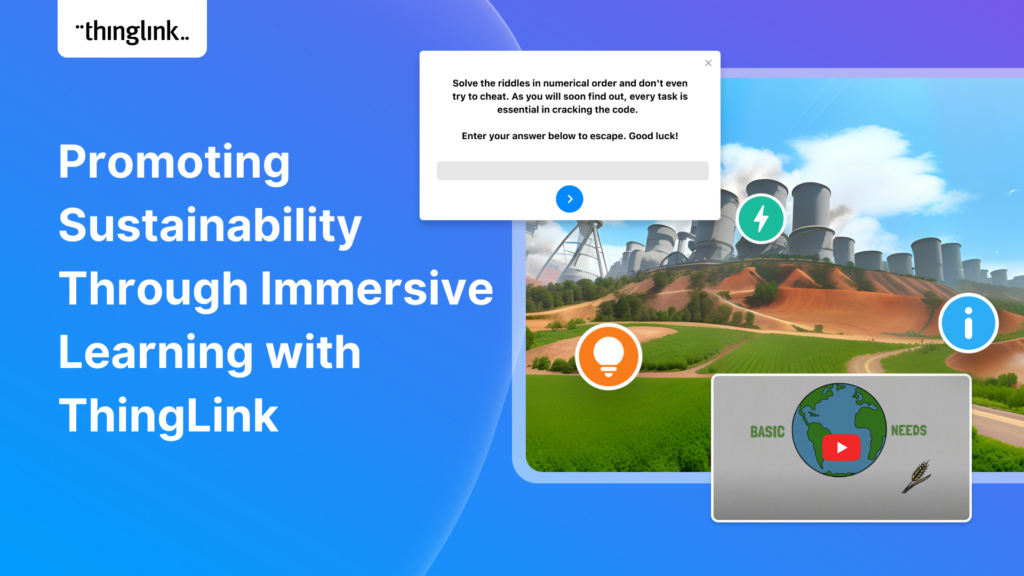
The world faces numerous sustainability-related challenges, threatening the future of our planet. Those issues are often hard to grasp without direct exposure to...
Discover the future of nursing education with the “Care for Europe” project, where immersive tours and interactive modules seamlessly prepare students...
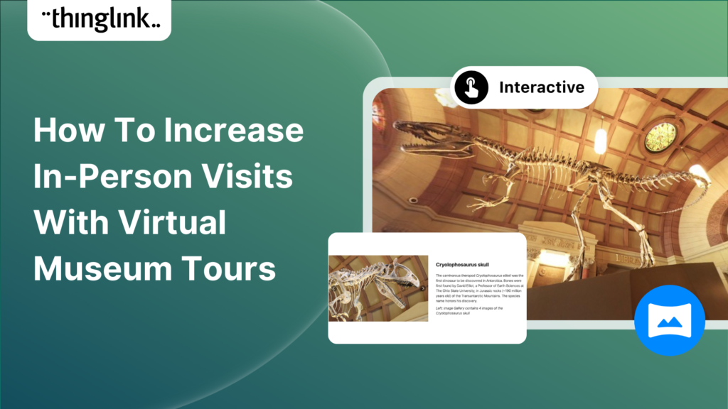
Museums worldwide are finding innovative ways to enhance their visitor experiences both on and offline. One such innovation is the virtual museum tour. Perhaps ...
Kyla Ball
4 min read
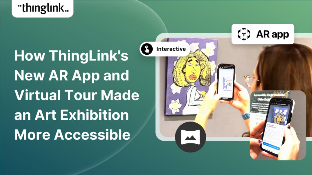
In the fall of 2023, Ohio State University’s College of Arts and Sciences Office of Distance Education (ASC ODE) began a collaboration with the college’s...
Kyla Ball
6 min read
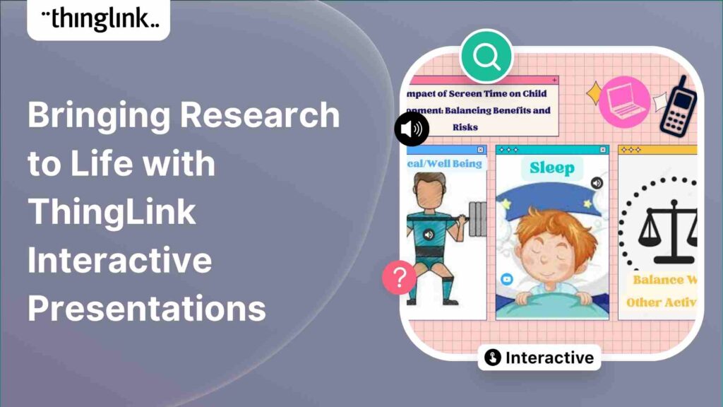
Regardless of subject, presenting your data and findings in an engaging and understandable way can be a challenge! Fortunately, ThingLink provides you with the ...
Kyla Ball
4 min read
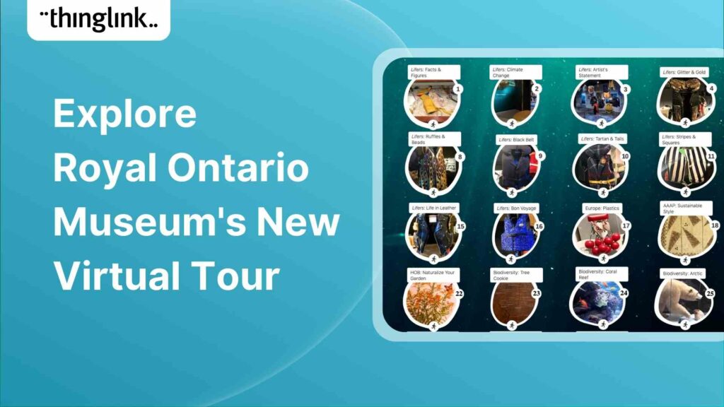
Behind the scenes at the museum Established in 1914 in Toronto, the Royal Ontario Museum (ROM) exhibits global art, culture, and natural history. It’s one...
Kyla Ball
4 min read
About KAESER KAESER Compressors is one of the world’s leading manufacturers and providers of compressed air products and services. They manufacture compressed ...
Kyla Ball
3 min read
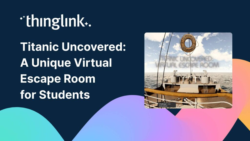
Educator Dwitney Bethel has created an incredible digital escape room using ThingLink’s Scenario Builder, set during the tragic maiden voyage of the Titanic...
Kyla Ball
8 min read
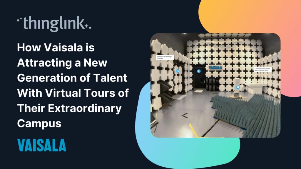
In this case study we look at how a global leader in weather and environmental measurements has opened up its incredible new R&D center and some of its other...
Kyla Ball
6 min read
In addition to using interactive media and virtual reality to create your teaching materials, why not also give your students the tools and technology to become...
Kyla Ball
5 min read
At ThingLink we are constantly striving to source and share with our creators the very best and most useful AI tools. To meet our criteria they must produce high...
Kyla Ball
6 min read
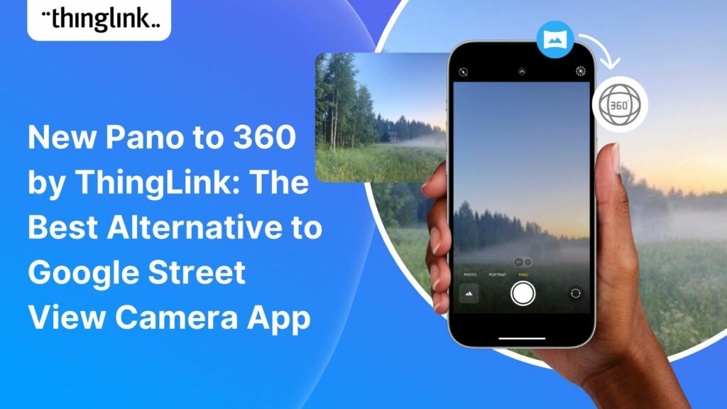
Dive into a universe of detail with Pano to 360: no more multiple shots, just easy, fully immersive 360 photospheres! Since Google decided to retire the beloved...
Virtual tours are now one of the cornerstones of real estate marketing, giving potential buyers the opportunity to view a property at a convenient time and place...
Kyla Ball
3 min read
ThingLink Launches a Revolutionary Solution for Capturing 360 Images In light of the discontinuation of the Google Street View Camera app, ThingLink has answered...
Kyla Ball
2 min read
QR codes are having a renaissance – and it’s well deserved! These versatile squares offer endless opportunities for creativity and engagement. In this...
Kyla Ball
6 min read
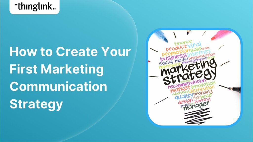
An effective marketing communications strategy is crucial for the success of any company, of any size. But for a small business or start up with no marketing team...
Kyla Ball
4 min read
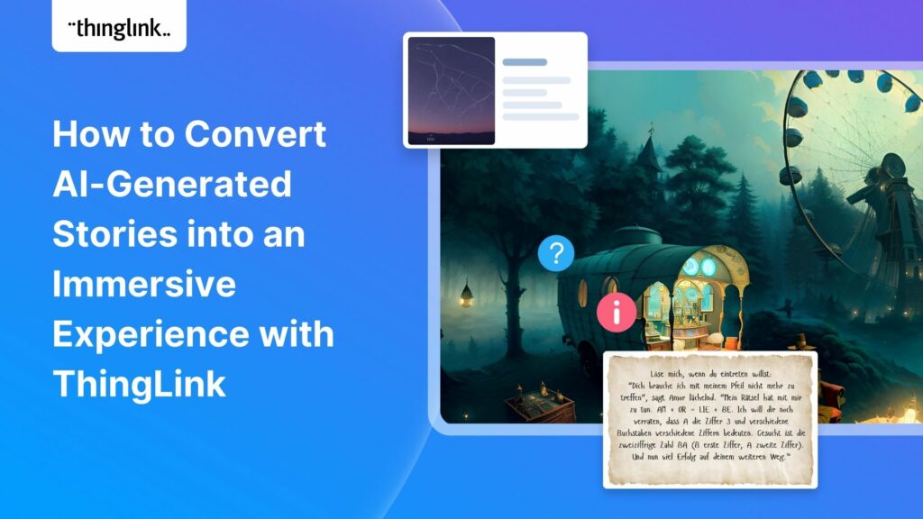
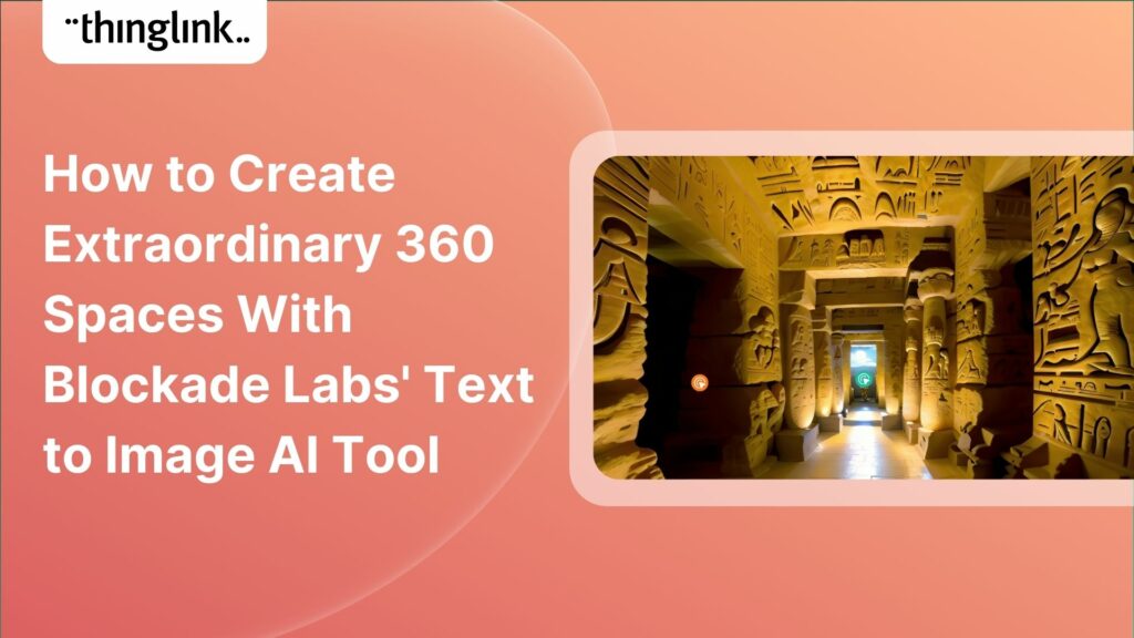
Learners can create truly extraordinary content when they use and combine the latest AI tools for image generation. In this case study we demonstrate and celebrate...
Kyla Ball
7 min read
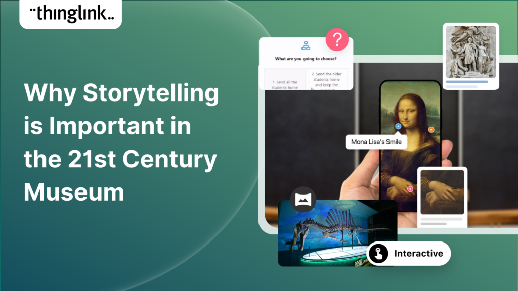
The Evolution of Storytelling in Museums It’s hard to imagine now, but there once was a time when traditional museum exhibits relied on static displays and...
Kyla Ball
5 min read
Virtual tours have become an integral part of the real estate industry, allowing potential buyers to explore properties from the comfort of their homes – ...
Kyla Ball
5 min read
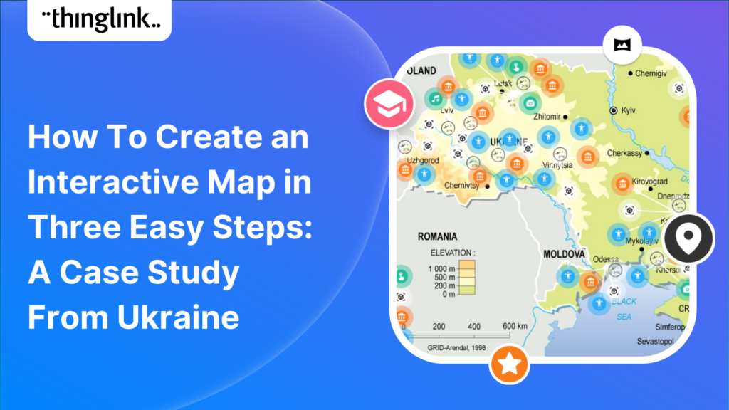
Educator Stephanie Woessner helped 17 schools in Ukraine to create an interactive ThingLink map together online. ThingLink spoke to her to hear how it was created,...
Kyla Ball
5 min read
ThingLink has been a leader in learning technologies, consistently seeking innovative ways to stay ahead of the curve. As pioneers of mixed reality experiences ...
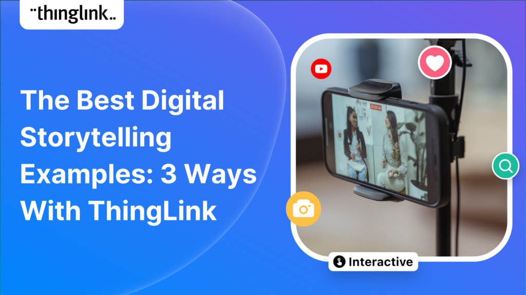
In this blog we look at what digital storytelling is, how it is being used, and provide three great examples of how ThingLink has been used for storytelling projects...
Kyla Ball
4 min read
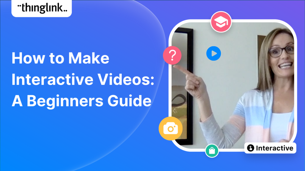
In this blog we look at how you can use interactive videos – either as a training or educational tool for your learners, or for marketing or ecommerce purposes....
Kyla Ball
4 min read
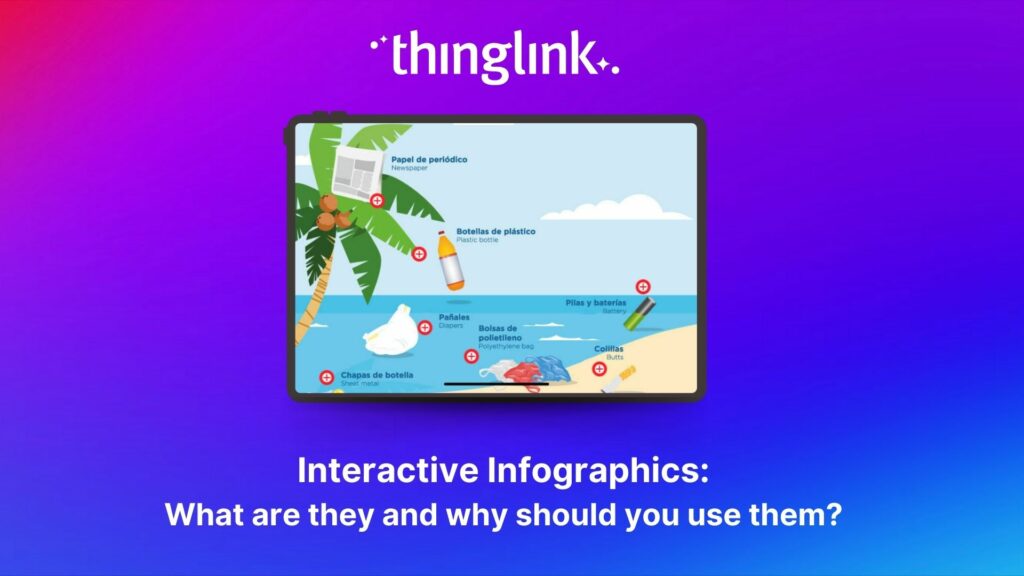
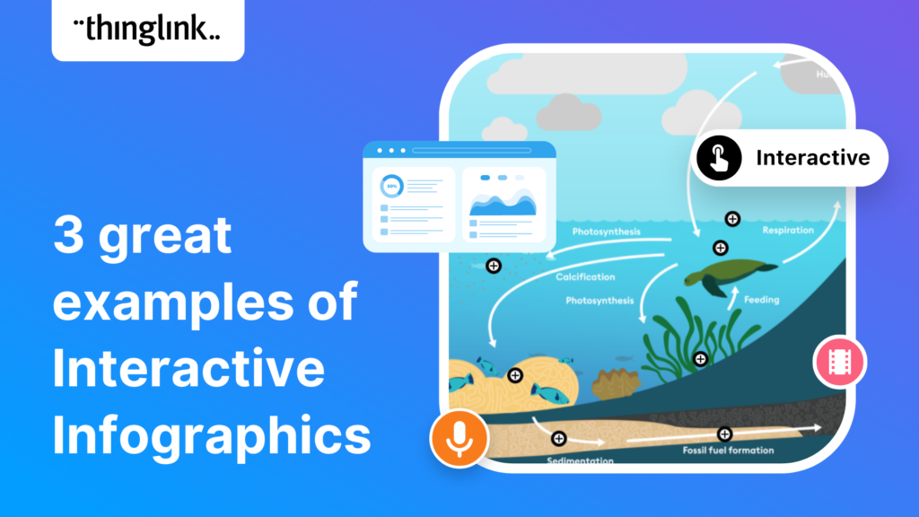
Infographics are a great way to present complex information in a clear and concise way. They are used for data visualization across every sector and can package...
Kyla Ball
4 min read
In this blog we have put together a little toolbox of 7 creative thinking skills to help you boost creativity in your everyday life and work. It’s a common misconception...
Kyla Ball
4 min read
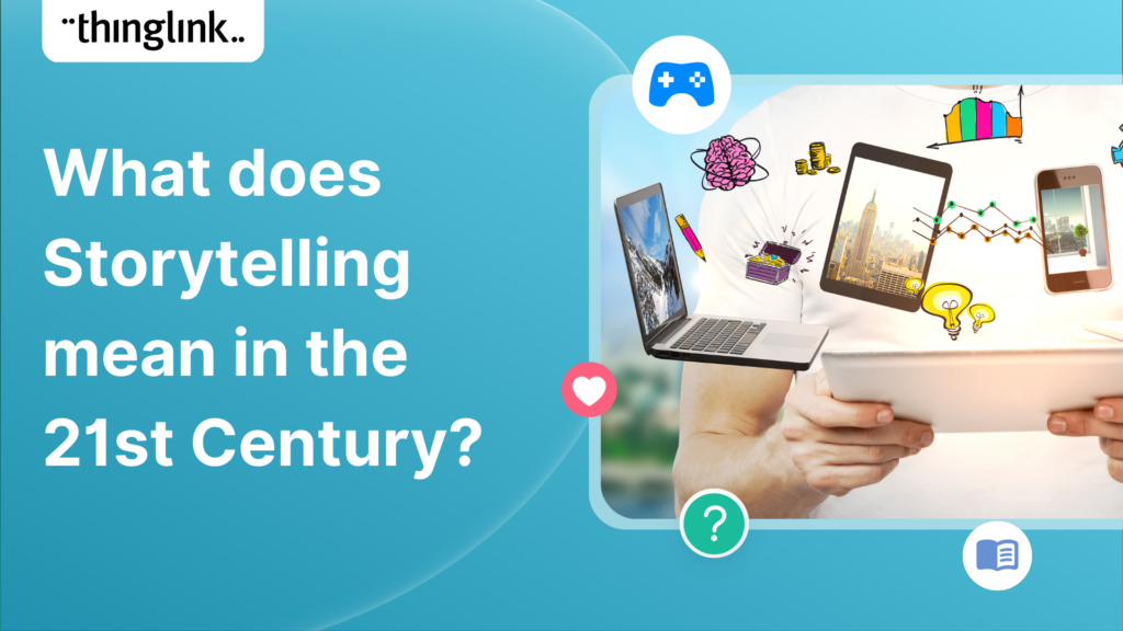
In this short blog we look at how storytelling has developed from its earliest forms to the ultra-short form content that we interact with, multiple times per day,...
Kyla Ball
5 min read
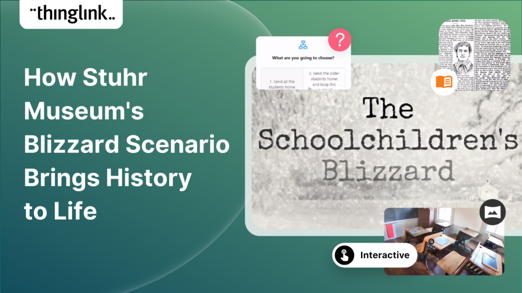
“Choose your own adventure meets tech and history” Stuhr Museum in Nebraska used ThingLink’s Scenario Builder to create an emotive and immersive branched ...
Kyla Ball
9 min read
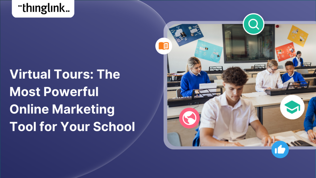
Introducing Virtual Tours – What is a Virtual Tour and Why it Matters for Your School A virtual tour showcases different areas of any location through linked...
Kyla Ball
5 min read
In recent months, GPT3 has moved out of the tech news sections and into the headlines. But what is it exactly? How does it work and why has it become such a hot...
Kyla Ball
5 min read
Why is content marketing important? Content marketing is a powerful tool for businesses to reach and engage their target audience. It’s the cornerstone of...
Kyla Ball
4 min read
What is content marketing? Content marketing is a strategic approach to creating and distributing valuable content that is designed to build relationships with ...
Kyla Ball
3 min read
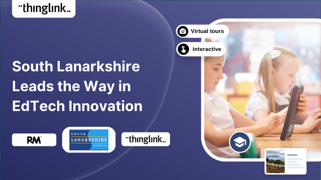
We are delighted to share this inspirational case study from RM, true education technology pioneers who work with thousands of schools and educational institutions...
Kyla Ball
2 min read
What is content marketing? Content marketing is a powerful strategy that businesses of all sizes can use to build an engaged audience and generate more leads. It...
Kyla Ball
4 min read
Content marketing has become an integral part of any successful business strategy, regardless of business type or size. It helps to create relationships, build ...
Kyla Ball
4 min read
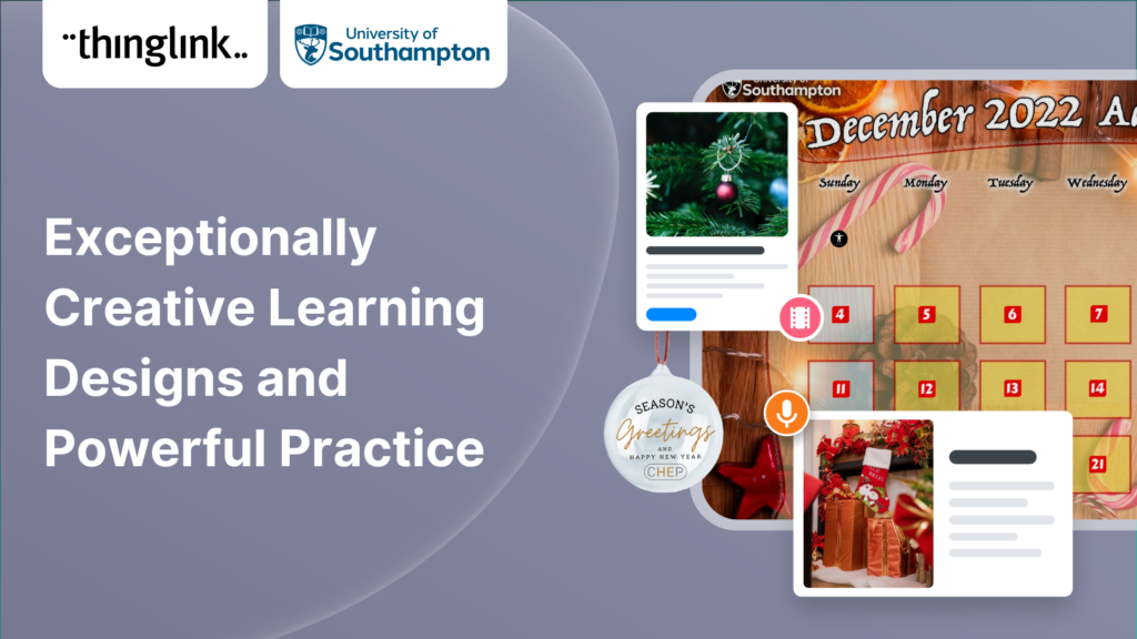
Our final post of 2022, from the University of Southampton is a fitting example to round off the year. The Centre for Higher Education Practice’s Advent Calendar...
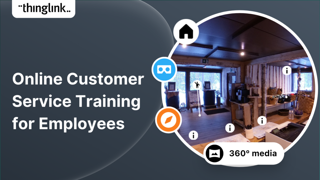
What is online training for employees? As many businesses have learnt in a post-pandemic digital age, online training or elearning for employees is becoming increasingly...
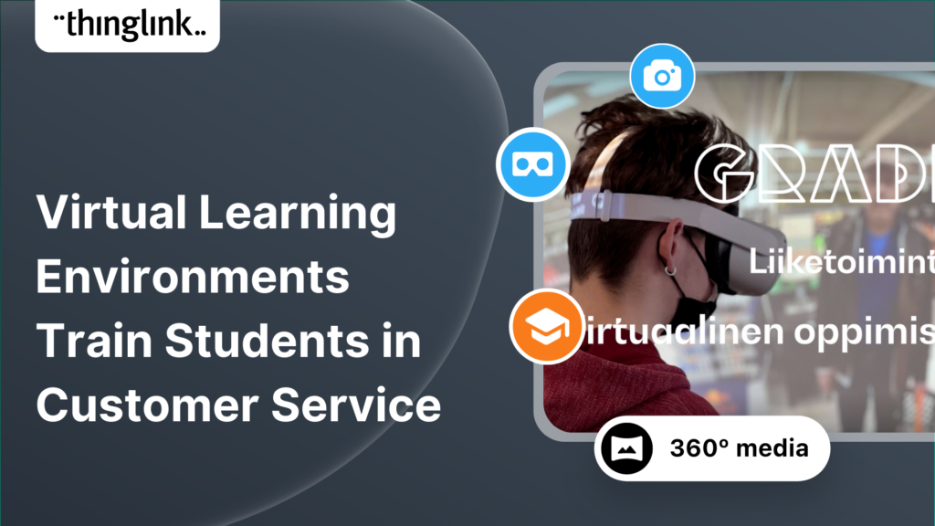
Gradia Vocational School has created new learning course content for the business education sector, using 360 video simulation technology in ThingLink. The elearning...
 Matias
3 min read
Matias
3 min read
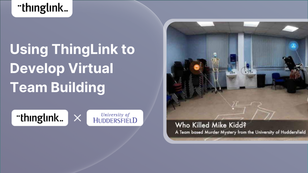
This case study was written by Tim Cappelli, Lead for Technology Enhanced Learning and Hayley Hewitt, Instructional Designer, both from the University of Huddersfield....
Kyla Ball
11 min read
Multimedia reporting is being used ever more frequently by all media platforms. In this blog we showcase a great example of multimedia journalism from Belgium which...
Kyla Ball
5 min read
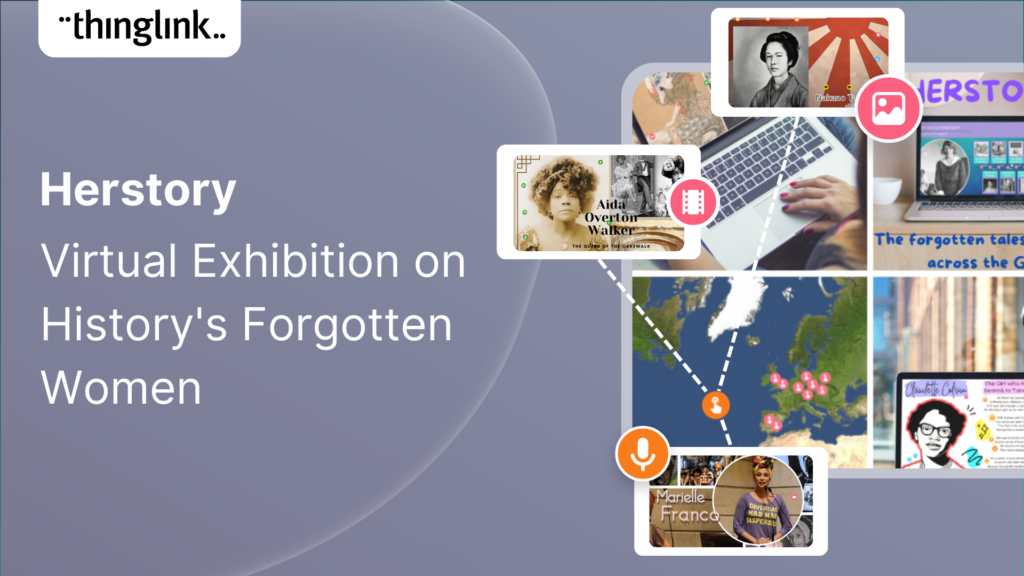
In this blog we look at how students from UCLan created a virtual exhibition about history’s forgotten women, the process they used to create it and the results...
Kyla Ball
5 min read
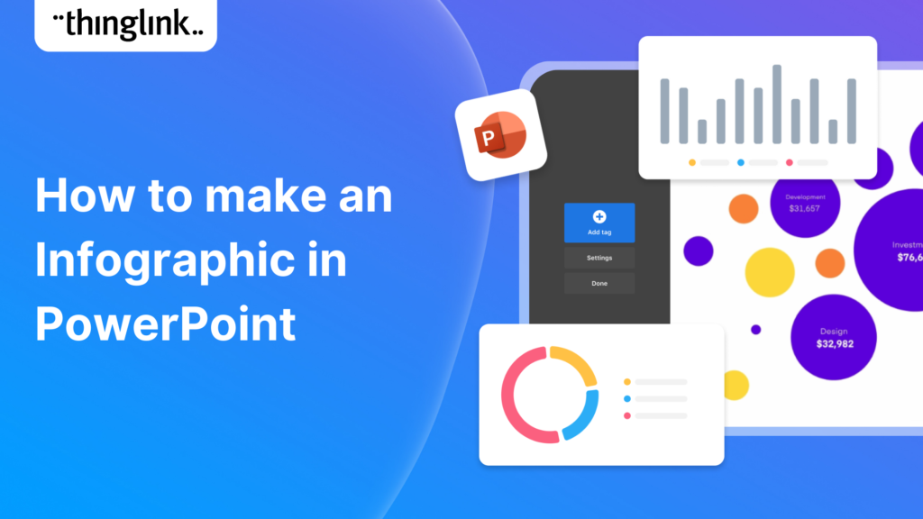
In this blog post, we’ll show you how to make an infographic in Microsoft PowerPoint. Working with shapes, images, icons, and text you can easily create a...
If you create or provide eLearning courses or workplace training, or you create any type of content marketing, you need to know how to use infographics. Infographics...
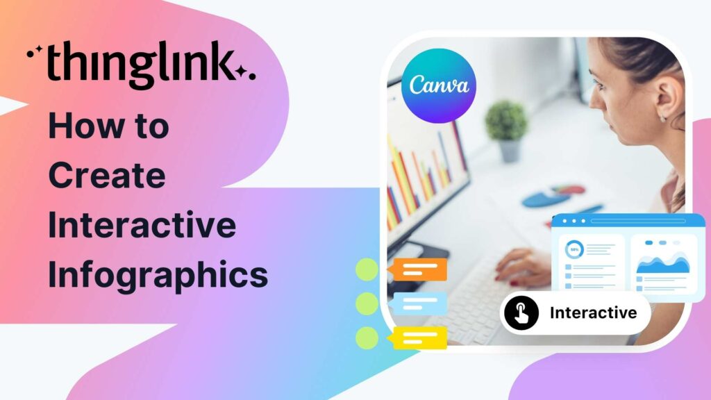
How can you make engaging interactive infographics if you’re not a professional graphic designer? In fact, creating this type of visual content can be really ...
Increase the effectiveness of your online training with multimedia interactive simulations and virtual tours. eLearning course content creation is easy with ThingLink!...
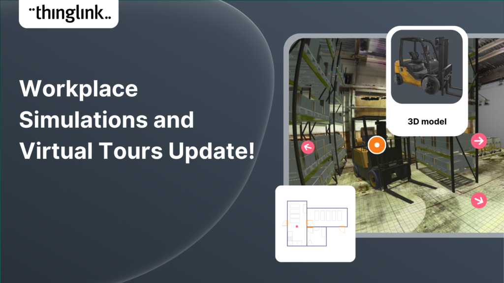
Your viewers won’t get lost with this brilliant new virtual tour feature from ThingLink! Our latest ThingLink update enables you to add a floor plan or ‘mini...
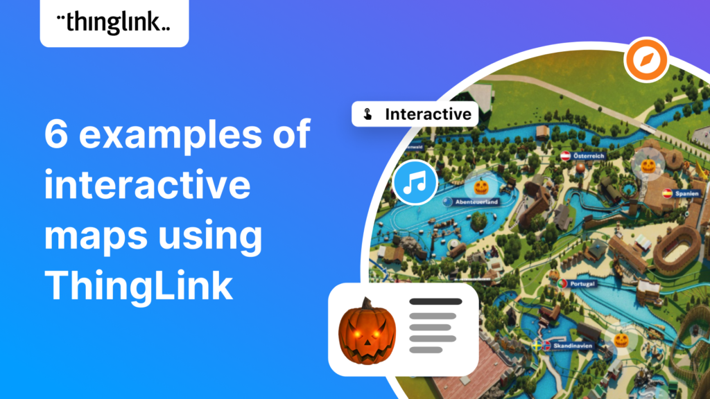
Some inspiring examples of interactive maps created by ThingLink users. Thanks to mobile apps like Google maps, we are now all used to using maps every day that...
Kyla Ball
4 min read
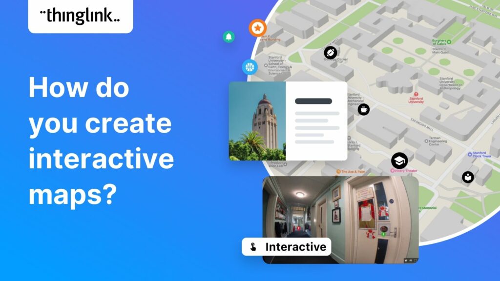
“There are those who follow maps, and those who make them.” Alberto Villoldo How to create interactive maps You don’t need to invest in an expensive...
Kyla Ball
3 min read
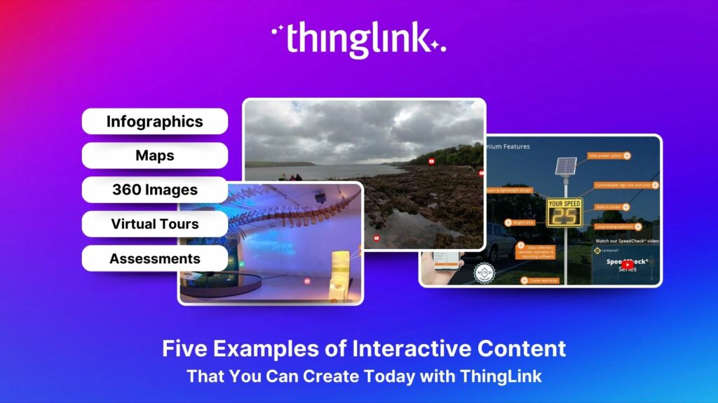
5 types of interactive content you can easily create today with ThingLink September 14, 2022 / 4 minutes of reading / By Louise Jones Stuck ...
Kyla Ball
5 min read
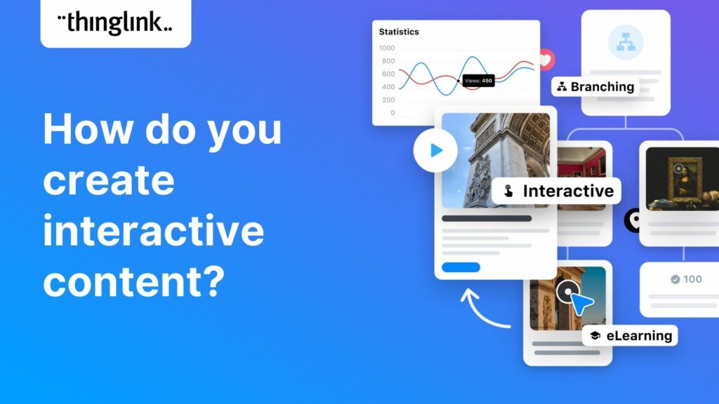
What is interactive content? The opposite of static or passive content, interactive content is one which users actively participate in or engage with. This...
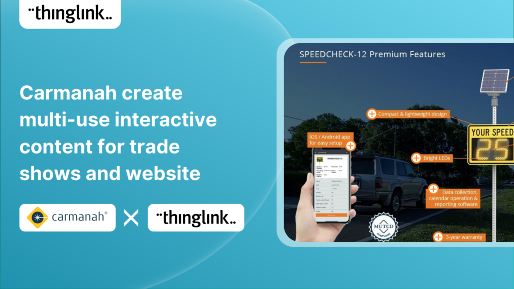
Background Carmanah is a company based in British Columbia, Canada, that helps improve road safety with a range of products including flashing beacons, radar speed...
Kyla Ball
5 min read
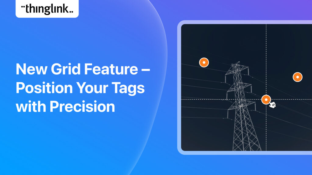
It’s now even easier to create slick and professional-looking interactive content with another of ThingLink’s handy new content tools. The Grid Feature allows...
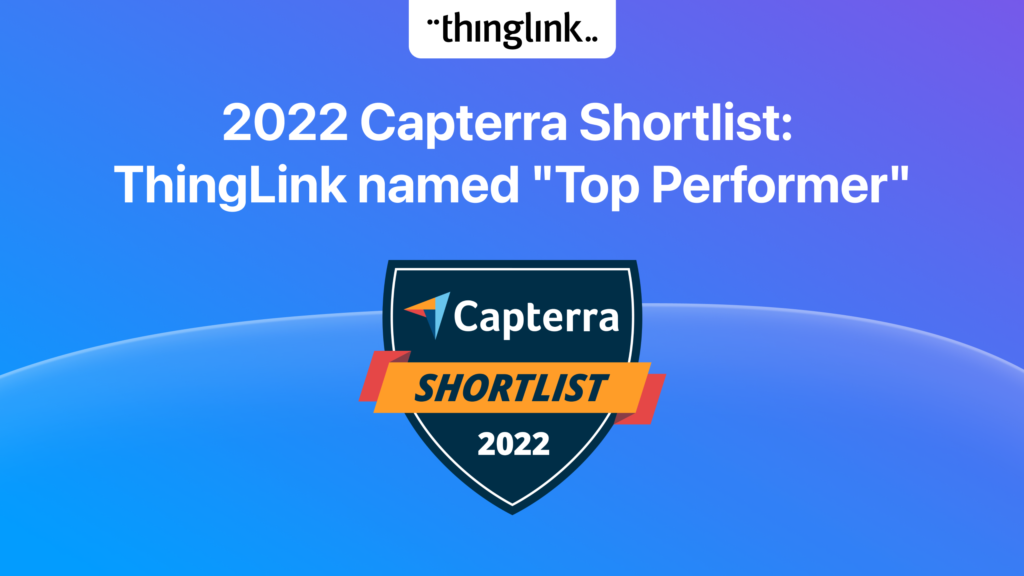
ThingLink has been placed in an impressive three separate categories by Capterra, the free online service that helps organizations choose the right software. In...
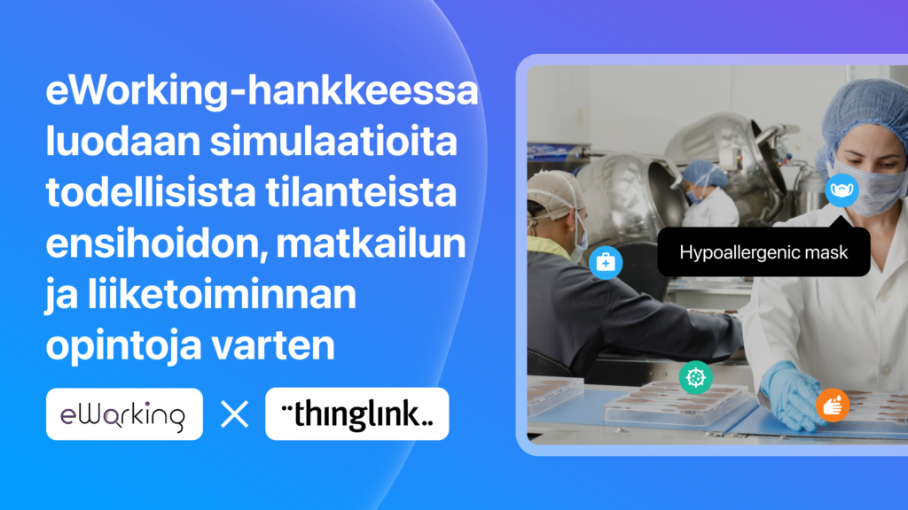
Ammattiopisto Samiedun eWorking-hankkeessa opettajat ja työnantajat luovat yhdessä koulutusmateriaalia, josta hyötyvät sekä opiskelijat että uudet työntekijät....
Matias
7 min read
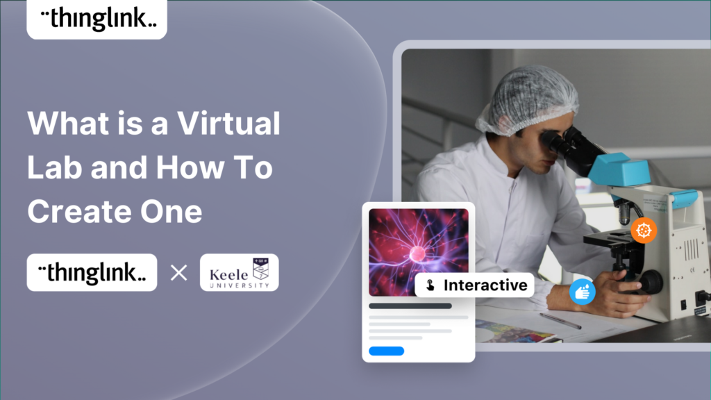
ThingLink Virtual Labs help address accessibility and inclusivity challenges for science students Many ThingLink creators in the Higher Education sector have carried...
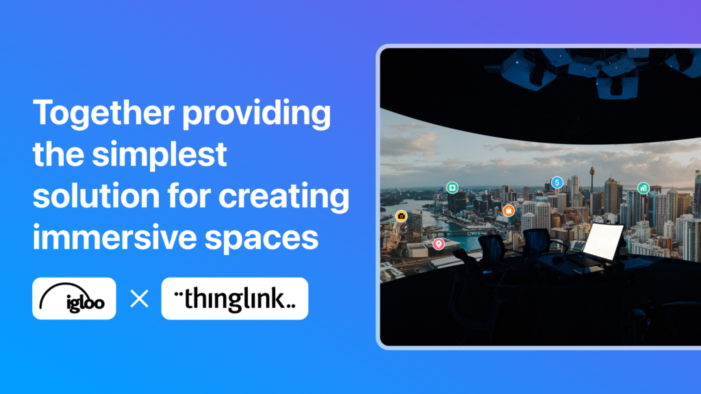
With over 20 years of visionary experience between them, ThingLink and Igloo Vision have crafted a reality for the future of immersive spaces. ThingLink is the ...
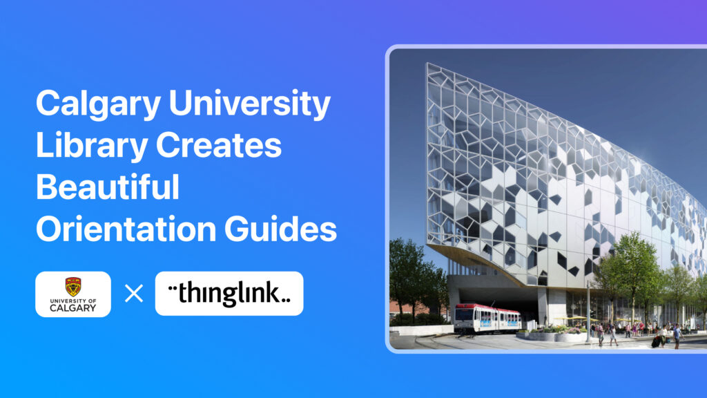
Calgary University Library creates beautifully simple virtual tours and orientation guides to assist new students with library resources We are always excited to...
Kyla Ball
5 min read
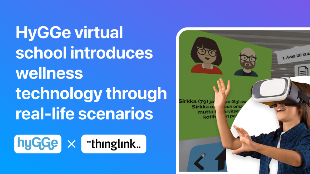
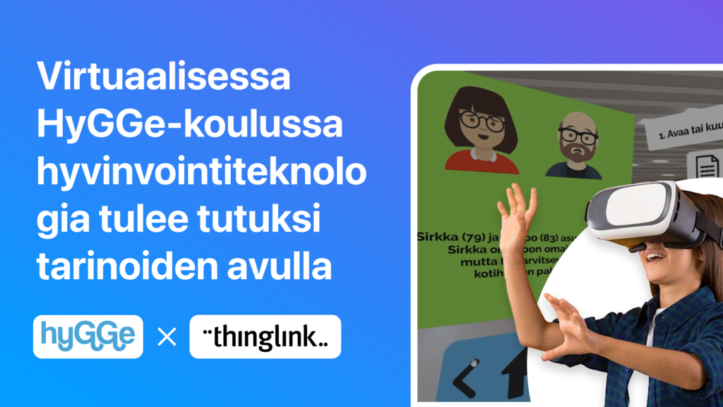
In Finland, eight vocational educational institutions collaborated to create a diverse online learning environment – the HyGGe school – where users ...
Matias
7 min read
HyGGe-hankkeessa hyvinvointiteknologia halutaan tuoda tutuksi hyvinvointialan opiskelijoille ja ammattilaisille tarinoiden avulla. Aidontuntuiset caset auttavat...
Matias
7 min read
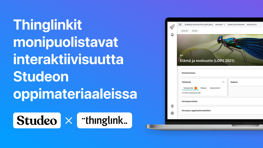
Miten sähköisissä oppimateriaaleissa voitaisiin hyödyntää teknologian mukanaan tuomia parhaita puolia? Miten voidaan esimerkiksi varmistaa, että opettaja...
Matias
6 min read