Interactive Infographics: What are they and why should you use them?
Infographics are the fastest and easiest way to present any complex information. In this blog we’ll show you how to create interactive infographic designs even if you’ve never designed anything before!
In this blog we cover:
- What is an infographic?
- Why infographics help
- Types of infographics
- Interactive infographics: recipe for success
- Interactive infographics
- How you can use interactive content to increase engagement
Chat with a product expert
If you’d like to learn more about how ThingLink can help you create interactive content, schedule an online meeting with one of our product experts below!
1. What is an infographic?
In New York in 1911, the prolific American newspaper editor Arthur Brisbane wrote “It is better to see something once than hear it a hundred times.” This quote encapsulates perfectly the benefits of using infographics.
An infographic is a graphic way of presenting information or data. It helps to show complex information quickly and clearly. Infographics are one form of visual and communication design.
The range of applications is wide. Infographics are used in geography, content marketing, journalism, education, statistics, technical texts, and numerous other fields. Infographics not only organize large volumes of information but also show the relationship between objects and facts in time and space, as well as demonstrate trends. Charts and graphs, data visualization, illustrative examples — all these can be shown as infographics.
Infographics began to gain popularity at the end of the 20th century, as a result of the information revolution. These days, Infographics are one of the most easy to understand ways of presenting information to a reader. Most importantly, nothing is as eye-catching to a reader as infographics. In fact it’s difficult for a modern reader to imagine a long informational text without any infographics at all.
Infographics are found in books, newspapers, manuals, business reports, presentations and all kinds of web design. Visually, infographics can be presented in different forms, for example, as a caricature, a diagram, an illustration, or a logo. Any image is suitable as long as it effectively presents data and achieves specific goals.
This simple infographic shows how the publisher supports its authors.
2. Why infographics help
The main goal of infographics is to inform. Often this tool acts as an addition to textual information, covering the topic in its entirety and containing some explanations. The style of information transfer can vary greatly. It all depends primarily on what the author pursues. What feelings does he want to arouse in those people who will observe his work? And who is the target audience for this image?
Visualization is a useful strategy. Beautiful and clear images, graphs, and charts are better perceived and remembered. Infographics help simplify business-critical processes and make information more attractive to customers and their employees. What can be visualized:
- Advertising campaign budget
- Annual reports of any level
- News that you would like to tell your customers and competitors so that they wouldn’t miss it
- Technical assignments (especially suitable for companies whose main customer segment are creators – designers, artists, copywriters)
- Complex information that needs to be posted on the site (mission, vision, strategy)
- Any detailed information that needs to be conveyed to the client
Here, the infographic shows how the advertised product will help you take care of your car.
The development of social networks, photo archives, blogs — all this contributes to the fact that you can quickly and simply convey your information to the public. Infographics in this situation become an excellent tool that can help you distribute the information required among your audience.
Did you know?
USA Today, publishers were among the first to use a combination of graphics and text in the newspaper business. They launched their project in 1982. For several years, the newspaper entered the top five most-read editions of the country. One of the most notable innovations of USA Today has become detailed, well-drawn pictures with explanatory comments — infographics.
Readers quickly realized the advantages of this method of transmitting information — infographics conveyed a message faster than text (one well-made drawing replaced several pages of text) and more than a standard illustration, thanks to the details of the pictures and accurate comments — information graphics.
3. Types of infographics
Visualization of information, data visualization, information design, visual communication, visual representation, visual stories — this combination of words is becoming more and more common. Increasingly, communications are built in the form of images and associations, which makes them more emotional and memorable.
Infographics are in demand and very diverse. However, there are several types of infographics, each with its characteristics and uses. Even though infographics can be applied in almost any discipline, some types of infographics can be distinguished:
- Numbers in pictures: the most common category that allows you to make numerical data more understandable.
- An expanded list: statistics, a timeline, a set of facts — all this can be visualized.
- Process and perspective: it serves to visualize a complex process or provide some perspective. It may not contain any numerical data at all.
Different types of infographics
- Static infographics: just images without animated elements.
- Dynamic or animated infographics: infographics with animated elements. The main subtypes of dynamic and compelling infographics are video infographics, animated images, and presentations.
There are three main types of infographics according to the type of source information:
- Analytical infographics: graphics that are created based on analytical materials. The most commonly used is an economic infographic: analytics is carried out according to economic indicators and research.
- News infographics: “fast” infographics, quickly created to illustrate and convey specific news.
- Chronological infographics: infographics, the creation of which uses data about an event that recreates the dynamics in chronological order.
4. Infographics recipe for success
When creating infographics, your main task is to convey the main points quickly and briefly. Try to embed a minimum amount of information in one picture. Good infographics should be large, clear, and clickable. It is worth paying special attention to design. To do this, use pointers, graphic effects, geometric shapes.
Experienced designers highlight essential important aspects that make good infographics:
- Attractive, comprehensible theme
- Smooth design
- Target audience features
- The numbers can speak for themselves
- Internal integrity
- Emotional colors
- High-quality сharts
- Scale selection
- Simplification
- Timeline
- Definition of concept and goal
- Authority and reliability of sources
Did you know?
Infographics in print newspapers began to be published more than 300 years ago. The Daily Courant, an English newspaper, published in 1702 material on the visit of the Spanish King Philip V to Cadiz Bay. The journalist supplied the material with a geographical map that displayed the meeting places of the monarch.
5. The next level: Interactive infographics
Recently, a new type of infographic is also developing. This is the so-called interactive infographic. The interactive infographic is a type of infographic in which the user is prompted to control the display of data and actively engage with individual interactive elements.
The key formats of infographic communication are:
- Static images. This is fixed information intended for reading and viewing.
- Moving images. The fixed information that the user watches, reads, listens. The image is animated or moving. You can use videos for this format.
- Interactive interfaces — fixed or updated information. In contrast to the two previous formats, the user can search and convert the displayed content, choosing what should be visualized. Both plot and research logic of information presentation is allowed.
Moving images or motion graphics, especially in combination with sound, attract people’s attention more than static pictures. For example, GeaCron — a history research company, has developed the World History Atlas & Timelines Since 3000 BC map, which allows you to track changes on the political world map over the past 5 thousand years.
To see how the borders of states looked 100, 200 or 800 years ago, the user just needs to enter the year of interest in the search bar, after which the map will be displayed in the current format that time.
How you can use interactive content to increase engagement
One of the most effective ways to engage your audience is to adopt static content and make your infographic interactive. Interactive infographics will help you split data into comprehensible chunks and present information in a way that suits the interests of the audience.
Interactive infographic interfaces range from the simplest to the most complex and dynamic. This type of infographic is especially suitable for presenting a large amount of data and prompting the user to study the information actively. Through the interactive interface, you can demonstrate both hard-coded information about the situation in the form of a dashboard as well as dynamically updated data.
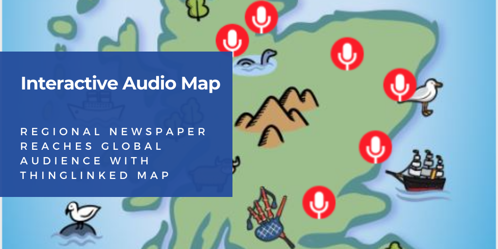
Interactive visualization of fixed information can be similar to a presentation or a slide show, where the user may only need to move from one slide to another. Another case may be a geographical map that shows data about a region selected by the user (for example, when you move the mouse over the region).
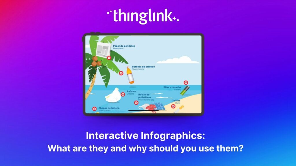
This simple picture encourages the reader to actively discover how long will it take to degrade different waste.
A dynamic interactive interface allows you to update both the display and the displayed information. Examples of this type of interactive infographic functionality can be found in programs for various kinds of analytics and CRM. An excellent example of an interface is the free financial management service mint.com.
Indeed the best infographics always provide valuable and useful information. Keep this in mind when creating visual content.
Want to start creating your own interactive infographics?
Try ThingLink for free
To start creating your own interactive content, start your free trial of ThingLink today!
Case Studies and Further Reading
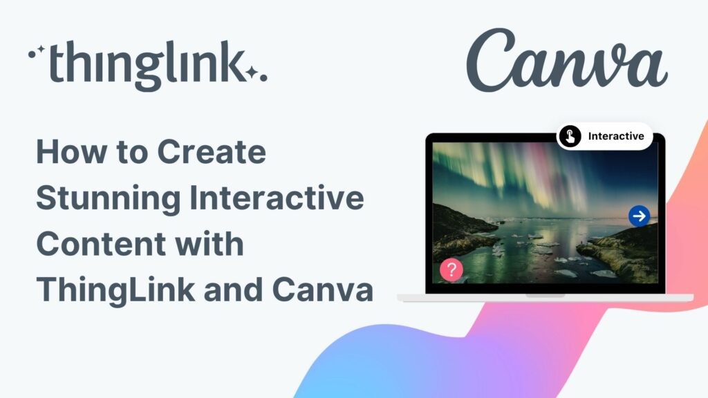
In the next blog we look at the best interactive infographic examples in ThingLink which will inspire you. In the follow up blog we show you how to create your own, with user-friendly Canva infographic templates to adapt! No graphic design skills or experience required. Simply use Canva’s free designs, images, graphics, fonts and animations for your own tailored content creation, alongside their helpful tutorials. Or how about reading our blog on interactive maps next for more inspiration?
For more examples, why not join one of our communities on social media such as Facebook or LinkedIn?
This blog is based on the article Infographics: What are they and how to use them at work and in everyday life by Alexey Solomatin, Head of Product at ThingLink